Visual elements
Textline views design as one of its most powerful tools. High-quality designs and visuals are core to what we do. Our visual elements help us deliver a clear message, create an easy-to-use product, and reinforce our credibility as the market's most secure business texting service.
Logo
The Textline logo represents our company, culture, and brand promise. Once you notice our logo has a chat bubble carved into a bold T, you can’t unsee it. Our logo represents our name and the promise of making business conversations easier.
We are proud of our best-in-town logo. Use the guidelines below to ensure it looks refined and is used appropriately.
Our logo
There are two versions of the Textline logo: primary and secondary.
Primary logo
In most cases, use our primary logo.

.png)
.png)
Secondary logo
Our secondary logo includes our title tag. Use this in situations where it’s beneficial to define what we do. This version should be used when there’s limited brand awareness or the industry context may not be clear.


The mark
When space is limited, the mark may stand alone to represent our brand.
Square icon
The mark has equal width and height, and is comfortably situated within a square frame.


Circle icon
The mark should measure 50 percent of the circle’s diameter.


Spacing
Ensure there’s adequate clear space surrounding the logo. Use the mark as a measurement reference.


Positioning
When creating a composition, refer to these general guidelines on how to position our logo. Align the logo within a corner or along the vertical center axis.


Logo misuse
Correct use of our logo strengthens brand awareness and ensures legal protection of our identity. Examples of logo misuse are outlined below.


Color
Color is an extension of the Textline brand. The primary colors in the palette exude trust, reliability, and simplicity – all characteristics of our product. The secondary colors add a pop of personality that allow us to be warm, approachable, and creative 🎨
Primary colors
Our primary colors are blue, gray, and white.
Secondary colors
Our secondary colors are green, red, aqua, and gold.
Typography
Typography makes written words legible, visually appealing, and on-brand. This design element builds personality, creates a visual hierarchy, provides website balance, and ensures readability.
Meet the font family
The Textline font family comprises three core typefaces.
Neuzeit Grotesk
Our primary typeface is Neuzeit Grotesk. It’s a geometric sans serif that’s simple, practical, and captures attention.

Freight Sans Pro
Our secondary typeface is Freight Sans Pro. It’s clean, poised, and invitingly legible.

Freight Text Pro
Freight Text Pro is another secondary typeface. It’s fresh and professional, but also projects familiarity.

Color combinations

White text on a blue background is used in small doses.

Black text on a white background is our primary and classic color combination.

White text on a black background is used sparingly.

When you mix blue and black, ensure it’s balanced and tasteful.
Hierarchy
Typographic hierarchy helps guide the reader through a page of text. It ensures the layout is reader-friendly as it’s scannable and visually categorized. It will show the reader which information is the most important and which is supporting text using visual cues.
PARAGRAPH - FREIGHT SANS PRO book - 16/24
PARAGRAPH SMALL - FREIGHT SANS PRO MEDIUM -14/24
EDITORIAL - FREIGHT TEXT PRO Medium - 21/34
Imagery
Textline is a highly visual brand. Illustration and photography are the building blocks of our visual identity and help support our content. This section explains how Textline uses imagery to capture our relatable and signature style.
Elements
These design elements are carried across both illustration and photography.

Illustration
Our illustrations work to compliment the message our content delivers. This section explains how illustration styles and dimensions should be applied.
Styles
Textline illustrations express our brand through a range of styles and textures.

Dimensions
Our illustrations have the freedom to live in multiple dimensions.

Photography
The photography we use always supports our content. This section breaks down our photography principles and stylization.
Principals
We value consistency in the photos we select to represent our brand.

Stylizing
We make images new by splashing with blue.

Graphic components
Graphic components help readers and customers visually understand the Textline product and website content. We use product visuals to showcase the product, benefits, and functionality. Icons serve as visual aids and space savers. This section shares the guidelines for using graphic components like product visuals, icons, and more.
Product visuals
Product visuals introduce customers and website visitors to our product’s functionality. It’s essential to display examples to familiarize people with Textline’s features and how the platform works.
Accurate UI
Accurate UI are untouched screenshots that display the product exactly the way it appears to customers. We place these screenshots in device mockups to bring product examples to life. This way, customers can see how our product looks when it’s used on a computer, phone, or tablet.

Conceptual UI
Conceptual UI is a simplified version of our product. We use thoughtful subtraction to communicate a visual message that’s easily digested. We intentionally craft these images to show our product to prospective customers in a way that is true-to-product without clutter.

Iconography
Textline icons are visual aids that guide users where they need to go, help save space, and break up important text. They’re simple, informative, and build on the visual language of the design system.
Styles
Textline uses multiple icon styles. They’re used in different places and scenarios.

Content style
When it comes to content creation, Textline’s mission is to inform and entertain. We use our content to add value, build relationships with our audience, answer common questions, and describe our product. Our content reinforces our credibility as the most secure and easy-to-use business texting platform on the market.
Voice and tone
The key to sounding like Textline is understanding our voice and tone. This section describes the difference between the two and shares rules to ensure you embody Textline when communicating.
While voice and tone are easy to confuse, they’re different. Voice communicates a brand’s personality and values. It’s a constant reflection of the brand.
Unlike voice, which remains constant, tone may vary depending on the audience, context, and information communicated. For example, although your personality stays the same, you would likely use a different tone when communicating with your boss vs. your best friend.
These differences hold true at Textline. Our voice is constant, while our tone changes.

Voice
Textline, the most secure business texting platform on the market, was built to make communication between customers and businesses simple. The content we create and the way we communicate support this mission.
Our voice is the Textline personality expressed through written and spoken words. Textline’s voice has depth and balances a few key characteristics. Read on to grasp it in full.


Trustworthy and reliable
Succinct and actionable
Relatable and balanced
Approachable and optimistic


Tone
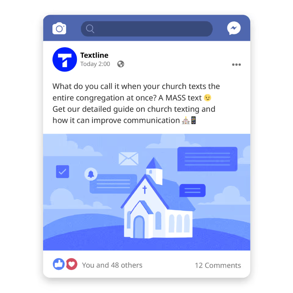
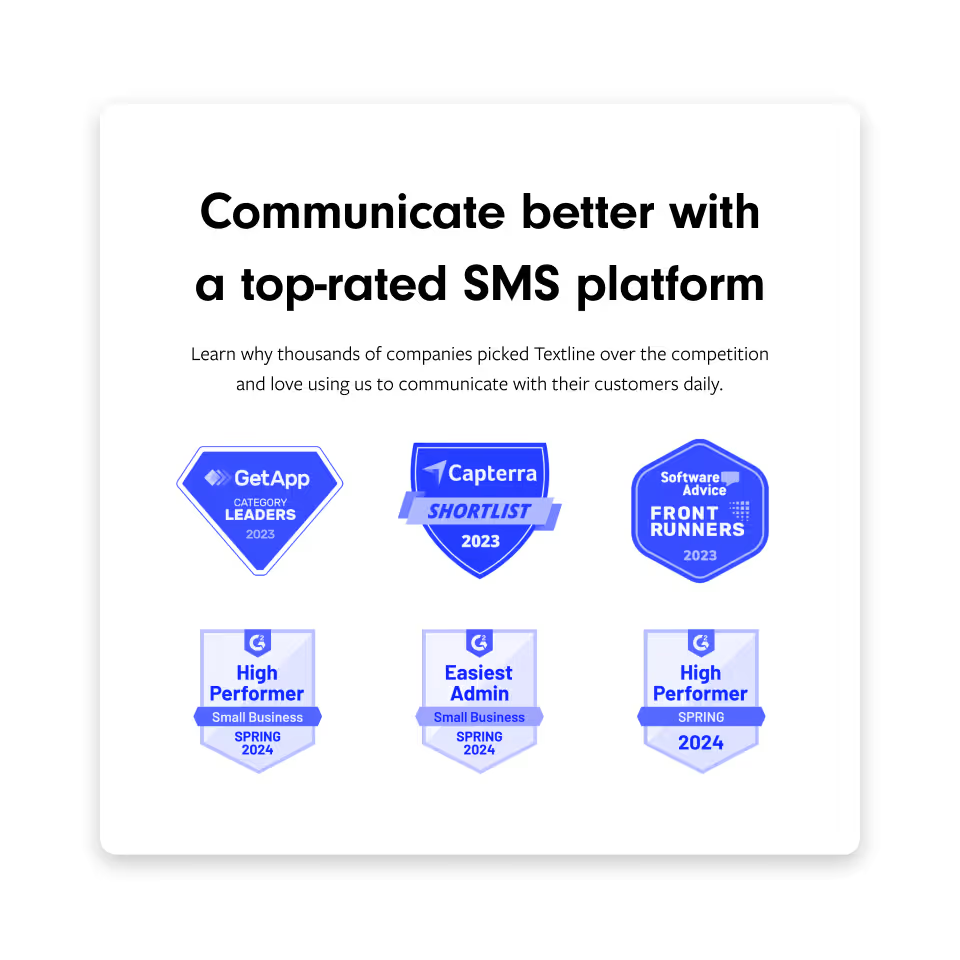
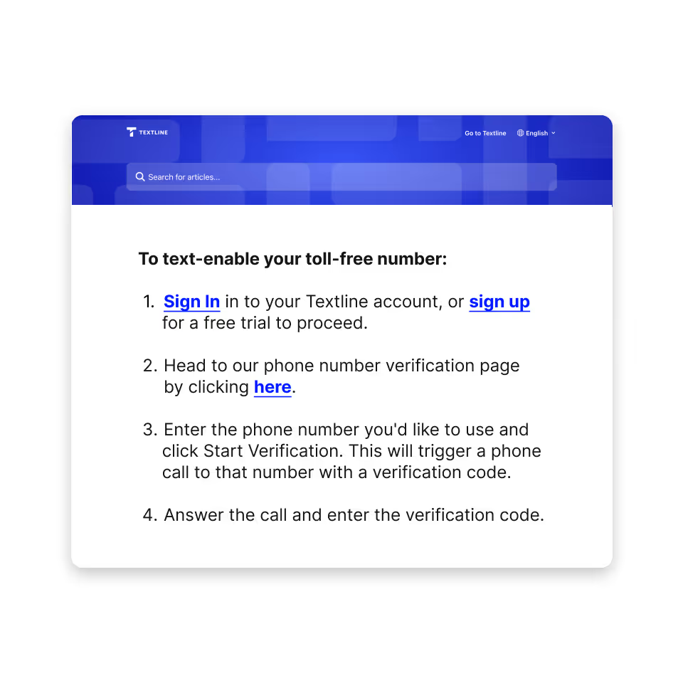
Whenever we create content or communicate, we consider our audience and context. We don’t change who we are, we just adjust our tone depending on who we're talking to. Below we share how we slightly tweak our tone depending on the scenario.
.webp)
.webp)


Customer issues or inquiries
Social media or newsletters
Blog or website
Customer education materials
Writing tips
Here are 10 tips to help you write and sound like Textline.

Editorial style
In this section, we describe our rules surrounding grammar and mechanics. We use these rules to make our content readable, consistent, and professional in appearance.
Abbreviations and acronyms
If you believe the reader won’t recognize the shorthand acronym or abbreviation, spell it out on the first reference. Use the short version on subsequent references.
See the following examples:
- First use: Federal Communications Commission
- Second use: FCC
- First use: Telephone Consumer Protection Act
- Second use: TCPA
There are some exceptions to this. If your reader would know the abbreviation, such as ASAP or VIP, you can abbreviate on the first reference.
Ampersand
Don’t use the ampersand as a shorthand for “and” unless it’s in an official company name.
Bolding words
Bold sparingly; use it only to call attention to a particular stat, word, or sentence.
Bullet lists
We love bulleted lists. When using them:
- Add periods if the bullets are full sentences.
- Omit periods if the bullets are fragments or singular words.
- Capitalize the first letter of the first word in the list.
Capitalization
Capitalize all Textline-specific features. This includes Announcements, Automations, Shortcuts, Routes, Whispers, API, and more.
Honor companies’ names for themselves and their products. For example, use lowercase and uppercase capitalization for iPhone and iPad.
See more capitalization rules under job titles and headlines.
Collective nouns
When referring to collective nouns, use singular verbs and pronouns like “it” or “its.” Some common words that are collective nouns are:
- Company
- Organization
- Brand
- Team
- Family
- Group
Colons
Capitalize the first letter after a colon when it begins a complete sentence or is included in a headline.
Commas
Use the Oxford or serial comma.
Contractions
Use contractions! They’re more concise and help convey an approachable tone.
Dates
Guidelines for writing out the date differ between marketing and within the Textline product.
For marketing:
When listing a month and year, spell out the full month.
When listing a month and date, spell out the full month.
When listing a full date, spell out the full month, date, and year.
When listing a day of the week, month, and date, spell it out in full.
If there is a character restraint, like in SMS examples, you can abbreviate longer months.
For product:
In the Textline product, we use numerals for the date.
Emojis
We love emojis at Textline! After all, we are a texting company 😉 While emojis are a great way to illustrate the tone and show personality, keep these guidelines in mind.
Omit punctuation if the emoji is at the end of the sentence.
Keep to one emoji per sentence.
Don’t use emojis in place of words.
Know the meaning of an emoji before you use it.
Stick to the default skin tone as it has the same appearance in light and dark modes.
Understand that sometimes no emoji is better.
Em dashes
Em dashes are used to set off examples, descriptive phrases, or supplemental information. They can be used in lieu of commas, parentheses, or colons.
We follow AP style; always insert a space before and after the em dash.
En dashes
Don’t use en dashes.
Headlines
Write all headlines and subheads in sentence case. Don’t use punctuation at the end of a headline or subheading.
Hyphens
Use a hyphen without spaces for compound modifiers or when two connected words precede a noun. Don’t use a hyphen when the modifier follows the noun.
Job titles
Capitalize job titles when they come before or after a person’s name. Unlike AP style, this includes when the job title is offset by commas.
When referring to a job title without a person’s name, don’t capitalize the job title.
Numbers
For headlines, headers, and subheads:
Always use numerals.
For body copy:
Spell out numbers less than 10. Use numerals for numbers greater than 10. There are two caveats.
One is when a number begins a sentence. In those instances, you’d spell out the number no matter what.
The other is before percent. You’ll always use the numeral, except if the percentage begins a sentence.
Percentages
For headlines, headers, and subheads:
Use the % symbol.
For body copy:
Spell out “percent” and use numerals except if it begins a sentence. You may use the symbol in graphics if space is an issue.
Phone numbers
- Write out the full number
- Use hyphens without spaces
- Use parentheses around the area code
Possessives
For simplicity, we differ from AP style. If a singular or plural noun ends in “s,” add an apostrophe.
Ranges
Don’t use the en dash or hyphen to offset ranges. Instead, spell out “to.”
Spelling
Typically, check the Merriam-Webster dictionary for the preferred spelling of specific terms.
We also always honor companies’ names for themselves and their products. Use their preferred spelling.
Below we share a few words we use often and want consistently spelled across our website.
Time
Use the 12-hour clock.
Only include a time zone if necessary and ensure the time zone is capitalized.
Don’t include a space after the last number.
Use am or pm (no periods and lowercase)
Versus
Abbreviate versus to vs. and always use a period.
Resources
Collaborating with Textline? Scroll down to download our brand assets. We’re proud of our brand and ask that you don’t alter our elements, files, or designs in any way.
Brand kit
Download all Textline assets in one click. The kit includes our logos, colors, product examples, and more imagery. Looking for a specific asset? Keep scrolling and take only what you need.

Individual assets
Logos
The Textline logo represents our company, culture, and brand promise. We put a lot of thought and consideration into our design and we thank you in advance for using it as intended.

Color palette
The Textline colors play a vital role in our brand image. The primary colors in the palette exude trust, reliability, and simplicity. They show our personality, enhance the user experience, and cultivate strong brand recognition.

Product examples
Introduce Textline by providing examples of the product itself! Dive into the user experience by accessing our screenshots and mockups.

Brand banner
Download our signature banner to use for partner profiles, integrations, and more.

Photo pack
We select images of consistent subjects, lighting, and composition to represent our brand. From there, we make them new with a splash of blue!

Illustrations
Illustrations make Textline a memorable brand and establish a delightful mood. Our expressive style enhances the visual experience and always supports the accompanied text.

Zoom backgrounds
Need a new background for your next virtual meeting? Use one of our custom Textline backgrounds and hear the complements pour in!
